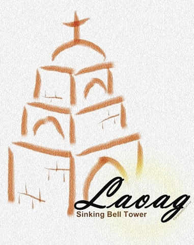
However, due to my incapacity to think of creative ways on how to recreate it, I ended up creating a poster to promote local tourism, Ilocos Norte tourism, that is. It’s amateurish, I know, but I find it satisfying. An outline of a tourist site, text with no frills, and an accent (the sunshine in the “o”).

I hope the Department of Tourism would consider minimalism in their designs. It might look bland but if one knows how to put the most basic elements in a logo, then it could be a powerful image. Try to search for other countries’ tourism logos and you’ll know what I mean.
For the meantime, try visiting my home province – Ilocos Norte. I’m sure you’ll love it here. Dumanon kay kuma ditoy kailokuan. :)
No comments:
Post a Comment